
Make Maine Yours
On Rebuilding Maine the Way's Brand After a Decade of Use


Helm Digital’s offices are tucked upstairs in one of the old brick warehouses that line Commercial Street in Portland’s Old Port.
“Do either of you want a coffee? Water?” Rebecca Falazano, Helm’s Creative Director, asks us.
“Water sounds great! Thank you!” I’m already on my third coffee of the morning, and absolutely buzzing—both with caffeine, but also excitement and nervousness for the session to come.
Christine and I take a seat in their conference room, where we’re joined by Rebecca, her husband Steve Pogson, who’s the Lead Strategist, Emily Gosselin (Art Director), and Brenna Anderson (Designer). After initial introductions, we get down to business—we’re here to give Maine the Way a rebrand after almost a decade with its current brand identity. Daunting to say the least.
We begin—not with the dissection of our current logo, what’s working, and what’s not, that I had expected of this meeting. Instead, Rebecca starts by asking us to list off as many adjectives as we can in fifteen minutes that define the essence of our brand.
Caught slightly off-guard, we begin rattling off thoughts: artistic, genuine, researched, exploratory, adventurous. We’re spitballing, bouncing off one another. Some words aren’t adjectives, but are still doing a good job summing up the brand—we say them anyway—travel, tourism, community. Before we know it, the timer goes off. Rebecca has written down 139 distinct words that represent the essence of what Maine the Way is, and what we hope it will become.
Then comes an even harder challenge—narrowing those 139 words down to the six that best represent Maine the Way. For the first time, Christine and I disagree. I’m pulling for storytelling, “That’s at the heart of everything we do!” I argue, impassioned.
“Yeah, that’s important, sure, but place, a real sense of place, feels more integral to our brand.”
We hem, and we haw, by turns prodded or cajoled into making decisions by the Helm team. We might be co-owners of the business, husband and wife, and quite aligned in business and life, but this process pulls apart the nuances of what the business means to each of us—those small disagreements actually get at the real heart of what’s important. By the end of this discussion—which, luckily, through a series of compromises feels more like an epiphany than a marriage counseling session—we land on six words (or words massaged into more specific phrases) that Helm used to sum up our brand:
“Maine the Way provides thoughtfully crafted visual storytelling to curious explorers, guiding them with intentional curation and an inspiring voice. We help our audience feel enriched through authentic connections and develop a deeper sense of place through rooted storytelling that captures the true essence of Maine.”
It’s a mouthful, as value propositions always are. But the tagline they brought to life out of our word salad was clean: Make Maine Yours.
Three words. I’ve been working daily, literally pouring myself into this brand for a decade, and I’ve never landed on such a succinct way to sum up what we do—something that conveys all the disparate parts of Maine the Way so completely. What I love about it is what it refuses to do. It doesn’t tell you where to go. It doesn’t give you a listicle, or a ranking, or a set of coordinates. It extends an invitation and then gets out of the way. Maine the Way has always believed that the best thing we can do for our readers is not to prescribe their Maine experience but to inspire them toward their own. I think we might be on to something here…
Every now and again, often while poking into some late-night YouTube rabbithole, I’m fed an advertisement for Neil deGrasse Tyson’s Masterclass. He begins, “A great challenge of life: Knowing enough to think you are right, but not knowing enough to know that you are wrong.” I have to come clean—I’ve never listened much past this point before pressing the skip button (sorry, Neil), but that line has always stuck with me. It isn’t a new idea—Socrates is attributed the quote, “The only true wisdom is in knowing you know nothing”—but it bears repeating in an era where it sometimes feels like the whole world is at our fingertips.
It took longer for me to learn this lesson than I’d care to admit; I have been battling a lifelong affliction of know-it-all disorder. Don’t get me wrong, I don’t think I know more than experts: you’d never catch me second-guessing a physician, a scientist, or an electrician. Instead, my particular malady leads me to believe I can tackle just about anything as a DIY project—even if there is someone better for the job. Major plumbing issues at the house? No problem, I’ll get to work armed with a set of adjustable wrenches and a how-to from Reddit. Not feeling like any bike on the market fits my exact needs? I’ll order a custom bike frame and build the bike up from components myself. Inevitably, in each case, I learn about halfway through the project why most sane people aren’t undertaking these activities themselves—it’s not to say I wouldn’t do it again, I probably would, but the scale and scope are always greater than I anticipated.
I’ve heard it said you need to be a little bit crazy to be an entrepreneur. Perhaps. Or maybe just naive. Regardless, my DIY mentality was put to use as Christine and I took Maine the Way full-time in 2016. When you’re completely broke, 24 years old, and a team of two, all you have is energy, ambition, and time. From writing the business plan, creating an editorial calendar, writing and photographing Issue 1 of Maine the Way, and filming and launching a Kickstarter, we wore all the hats. Inevitably, I brought this same DIY mentality to Maine the Way’s branding and design: despite having near-zero graphic design experience, I was artistic, literate with the Adobe suite, and felt I had an innate sense of when design was working and when it wasn’t. If I could be a critic of bad design, surely I could reverse-engineer that into the design language for Maine the Way, right?
It is a bit embarrassing to admit to the hours and hours that went into this design process. We sat down, put our heads together, and came up with a few concepts we wanted the design to convey—clean, timeless, white space, modern, balanced. From the get-go, I struggled with the last piece of it—how do you balance a three-word brand name with the words having 5-3-3 letters respectively? It just wasn’t clicking.
One of us, perhaps Christine, thought maybe if the “M” of Maine and “W” of Way were mirror images of one another, that would provide some balance. Can you guess what I did next? That’s right—I taught myself how to use an open-source font design application, and created a brand new font for our brand. And when that didn’t quite land, I went back to the drawing board and drew another typeface with thinner, more vertical letters. Maybe this would work?
Armed with the new typeface, I headed back to Adobe Illustrator, ready to hammer out the wordmark once and for all. Twelve hours later, the sun long-below the horizon, I looked at a growing mess of ideas on my Illustrator artboard—even if this was the font for our wordmark (which still seemed uncertain), I felt no closer to getting a grasp on the ideal kerning, line weight, and density of the final logo.
Simultaneously, I was also trying to tackle the interior page design for the articles in Issue 01 of Maine the Way. As you can imagine, similar problems were emerging—I had enough know-how to get close to what I wanted, but this was supposed to be a beautiful art publication. It needed to be elegant, elevated, perfect. My design was only good. That wouldn’t do.
Frustrated, we scheduled a meeting with renowned Portland designer Danny Gugger. (now based in NYC) He sat down with us, looked at all my half-baked ideas for both the logo, the magazine cover, and the interior pages, and he asked me for access to the Dropbox folder with all the articles and photos for Issue 01. I, of course, obliged. Any help would be much appreciated.
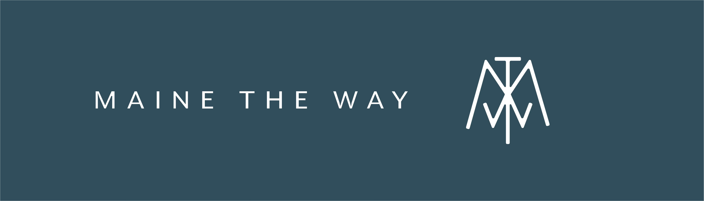
Just 48 hours later, I got an email: “Cam, I had some time to work on this. Let me know your thoughts.” Attached was an Adobe InDesign document with all 160 pages of the magazine roughly laid out, a beautiful cover design that would get slightly reworked to be our final printed cover, and a monogrammed logo with the letters MTW overlaid on one another—what we’d affectionately call our “trail marker” logo (for its slight resemblance to the Appalachian Trail logo on round trail markers) that has been the face of the brand since 2017.
In that moment, I saw the efficiency of a true professional—what would’ve taken me weeks or months of work took Danny just days. It was the first moment when I let go of some control over the visual identity of this new project. Hiring Danny, a third party, to come in, take a look at what we were building, and allow him to create a visual identity to represent us set Maine the Way off on the journey we’ve been enjoying for almost a decade now. Christine and I will always be grateful for the vision, design language, and experience Danny gave us.
That said, this “trail marker” logo was imperfect from the start. It was a compromise. A compromise financially—Danny helped us with the design for a project rate just a step above pro-bono, as we were two twenty-somethings self-funding this idea, and there was no way we could ask for a series of design revisions and iterations the way you typically could in a design contract. It was also a compromise between two new business owners who didn’t fully understand the brand they were launching. Was it a magazine? An Instagram? Traditional media? Social media? We had ideas, but nothing concrete. And, finally, it was a compromise time-wise. There was no room for trying to flesh those ideas out further, to get into the meat of what our future brand would be—we were both working full-time, while also photographing, writing, and creating the first Issue of Maine the Way on weekends and evenings, and there simply wasn’t the bandwidth to micromanage a design like this.
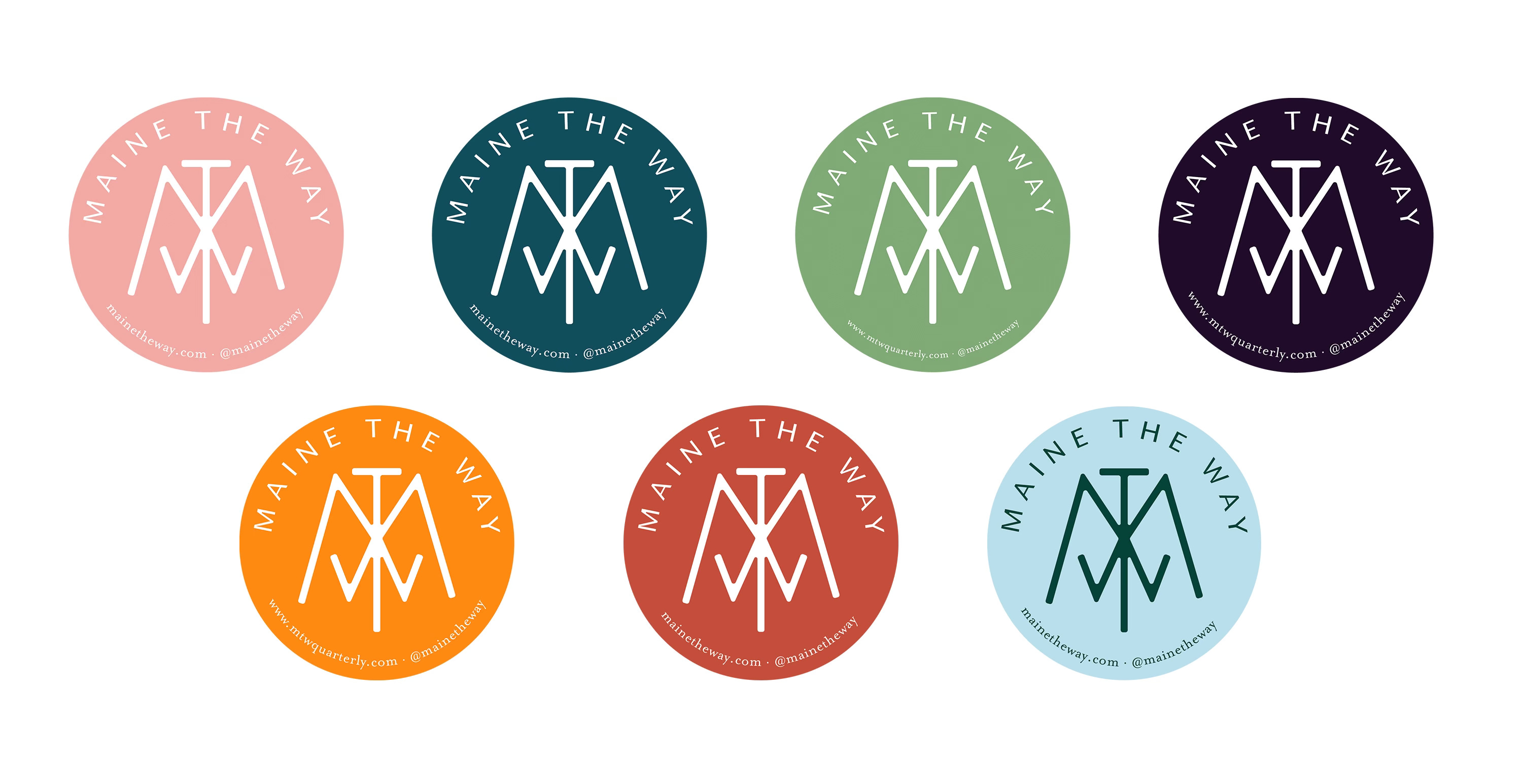
So it was that the MTW monogram, the “trail marker,” became the face of Maine the Way. It worked well—it was recognizable, unique, and fit various formats. But there was always a sense, one we both shared, that it didn’t fully sum up the brand the way we wanted it to. What would Maine the Way’s branding look like if we didn’t have to make those compromises? The question lingered, but each year we’d find ourselves nose to the grindstone, working IN the brand, not ON the brand. So it goes as a small business owner.
As a recent father, many of my thoughts these days circle parenthood—it is all-encompassing, all-consuming. Not unlike the single-minded fervor of starting a small business. And so it is I find myself mulling over the pressure that comes with picking out the perfect name for your soon-to-exist child—something that will match this future being, feel authentic, perhaps even influence them in some unknown ways, all while you are completely in the dark about the person you’re naming. Such pressure! I can’t help but feel that branding a new company is much the same—you are creating a key component of the future company’s identity without yet understanding the brand. Getting that right, or wrong, can have a lasting impact on the brand.
Legend has it that my great-grandfather and his siblings were given placeholder names at birth by their parents, and then asked at age eight to rename themselves—legally no less—to an eponym more suited to their personality. Thus, my great-grandfather took on the name Vene—completely unique, and, I assume, very befitting of him.
Brands, too, are not locked into their identity. Rebrands happen all the time—to keep up with the times, modernize, simplify, or better represent a changed business identity. But for a small business, this process can be scary and overwhelming. Scary enough that it just keeps getting pushed off—in our case, at least.
I don’t want to insinuate that we were fully complacent— our creative minds kept churning in the background. There were napkins and Post-it notes on our desks with sketches of ideas, logos in their infancy.
Twice, we even hired designers to bring these sketches to life. Twice, we were left with new logos that felt flat and remained unused and unseen—not the fault of the designers, who executed our half-baked ideas, but of our design brief. The truth was, we were trying to skip the hard part of the rebrand—we tried to fast-forward to the new logo, without taking a deep dive into why the “trail marker” logo no longer worked.
Eventually, as the distance between the brand we’d created and the branding that represented it widened into a gaping maw of brand discomfort, we got serious about making a change. By 2025, I’d like to think I’d learned my lesson on DIY projects—at least within the branding department—and when combined with a nudge from Christine (who came to this realization long before me), the question switched from “How can we fix it?” to “Who can help us fix it?”
The answer, of course, was easy. We’d been fans of the creative work coming out of Helm Digital, and particularly their brand-building division Vernacular, for years as they worked with Maine favorites we’ve always looked up to like Whitten Architects, Viand Mercantile, Little, and Riverbend Farm, among others. From what we’d heard about their process, this wouldn’t be a light reworking of our logo. This was a rebranding deep-dive—something Maine the Way desperately needed. We jumped in with both feet—time to trust the process.
The work with Helm began where all good brand work begins: with questions we didn’t entirely know how to answer. We began with the discovery process that morning in their conference room—a workshop, a positioning exercise, a long excavation of what Maine the Way—what we—actually believe. We mapped our company culture, our customers, our voice, our impact. We generated those lists of words that felt true to us: knowledgeable, gritty but balanced, real over polished, slow journalism, seasonal, salty. We built theoretical customer profiles—the pandemic transplant from Boston who moved to the West End and now takes annual canoe trips, the Midcoast woman in her fifties who wants to dive into Maine, her way. We talked about what we weren’t, which is often more clarifying than talking about what you are.
The logo conversation began with a specific creative problem: the monogram worked for the magazine, but less so for Maine the Way in all its facets. How do you wrap up all the things we already are: a publisher, an Instagram, a Substack, a Youtube channel, a Maine travel guide, as well as our dreams for what Maine the Way might still become: a fine art print shop, a gallery, a lifestyle brand, and who knows what else?
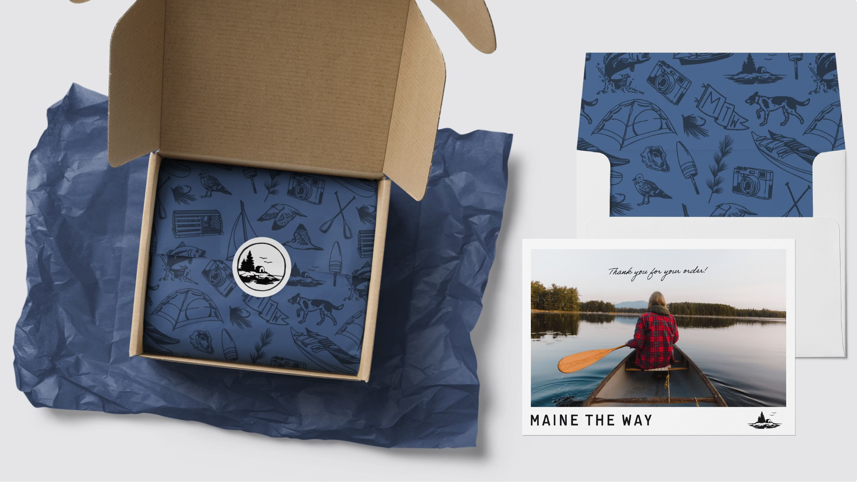
Helm presented multiple directions. What we chose—and then kept refining, across multiple rounds—was the island mark. A small granite island, the kind you see from a kayak or a ferry or a Maine Coast charter, with a stand of spruce trees and a small structure: a fish shack, a dockhouse, something human-scaled and specific to a working relationship with the sea. Two birds in flight above it. The whole thing reflected in calm water below.
The instinct to choose this logo was immediate. Guttural. But then we had to perfect it.
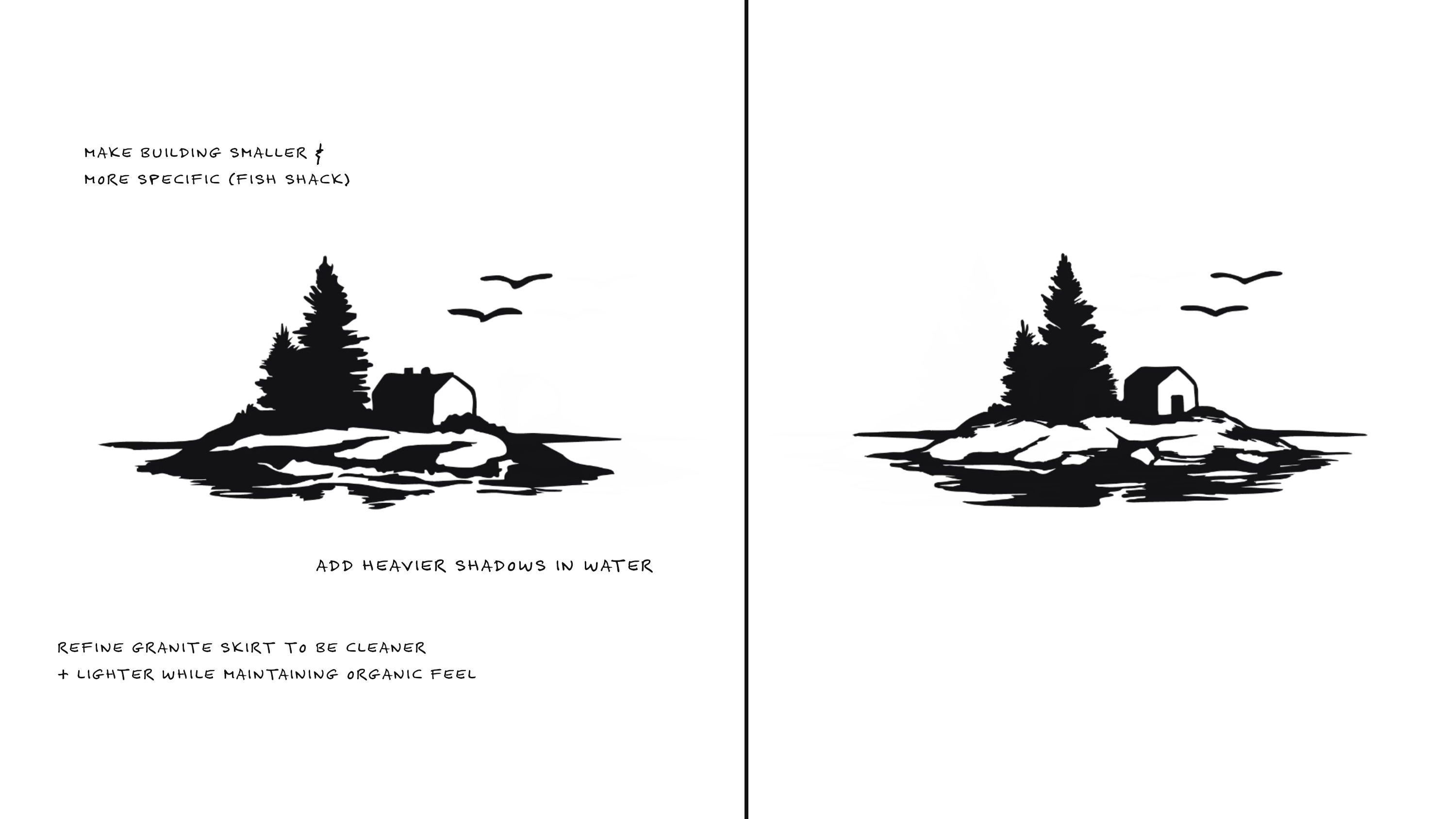
What’s interesting, looking back at the feedback notes across rounds, is how consistently we pushed in one direction: more specific, less generic. Make the building smaller. Give the granite more definition. Clarify the line between rock and water. Make it feel less like a symbol of Maine-in-general and more like a place you might actually find, a place you might actually know. This is, I realize, exactly how we approach our editorial work—not Maine as backdrop, but Maine as subject, with the kind of specificity that makes a reader feel they’re being trusted rather than sold to.
The two seagulls are Christine and me. That detail matters more than it might seem. The logo had to contain us—not our faces, not our names, but the two of us, partners in this thing, headed somewhere together, wherever the winds of business or life may take us.
Good design, like good photography, is mostly about what you leave out.
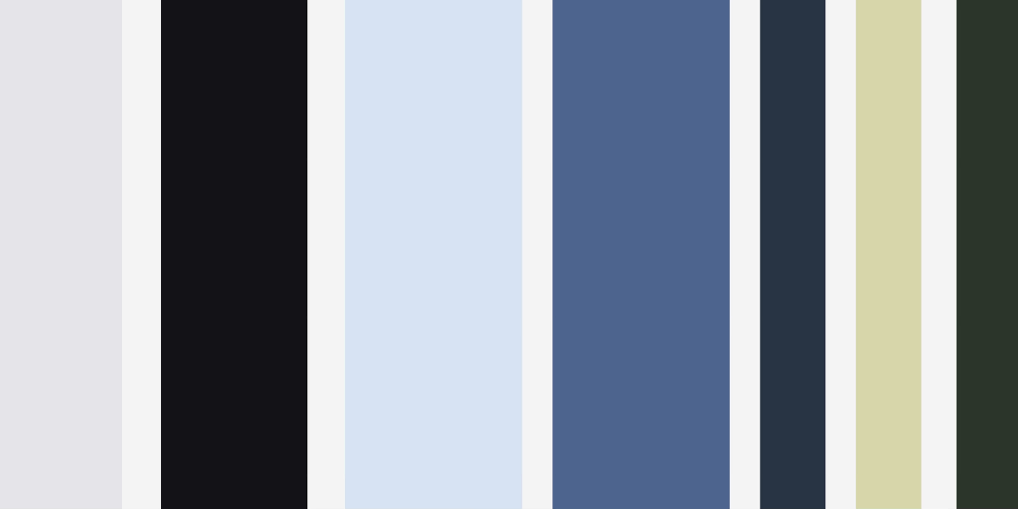
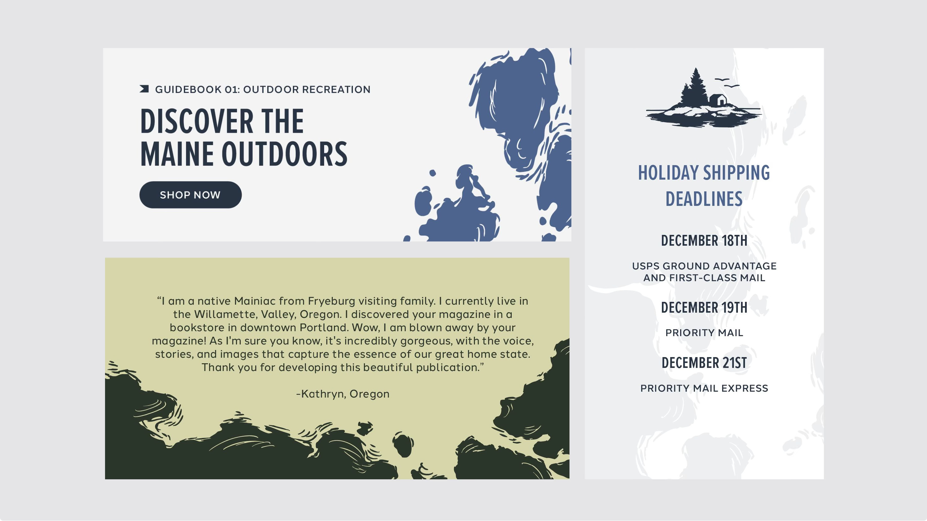
The color palette Helm built for us—a system they called Blueberry Fields—is the visual argument for this. The palette starts with white and black, of course, but then includes wispy gray and smoke as the neutral colors with more personality. Then it runs through sea grass and pine into sky blue, blueberry, and midnight. It’s not necessarily the Maine of postcards: no lobster red, no easy nautical navy. It’s the dreamy salt-softened sky on a Downeast morning, the deep Atlantic hue an hour after a storm, the color of a spruce tree when you put your face in close to take a whiff. Cool-toned, rooted, and specific without being predictable.
What it communicates, in aggregate, I think, is that we’re not selling you the idea of Maine. We’re already inside it.
The typography follows the same logic. Historically, we’ve used Gotham Bold as our title text—a competent, clean, utterly generic font that could belong to any lifestyle brand in any city in America. What the Helm team proposed was a system built around character: a bold, all-caps wordmark that anchors the logo, balanced with a clean sans-serif body text that blends in while emphasizing legibility. The monotype subheadings bring old-style character, and also tie in with our brand’s history of writing Issue 02 on a typewriter—when a traumatic brain injury forced me to stay off computer screens for months—it’s those little details that matter. Each font has a job. Together, they create something that reads like a publication that has thought carefully about every surface it occupies.
Looking at the completed brand system from Helm, laid out in full—logo mark, palette, typography, patterns, graphic elements, all the variations—I feel something I didn’t expect: relief.
Not because the old logo was a source of distress. More because I didn’t realize how much low-grade cognitive weight I’d been carrying, the weight of knowing that the thing people saw when they encountered us wasn’t yet the full picture. That gap between who we are and how we appear—it costs something. Not everything, but something.
What Helm made is a system capacious enough to hold what Maine the Way has become. The island mark works on a Substack header, on the side of a van, and embroidered on a hat. The palette works in a magazine, on a tote bag, and on the walls of a future gallery space. The tagline works in a caption, a bio, a keynote. This is what a real brand identity is supposed to do: not announce itself, but enable everything else to feel intentional.
If you’ve been following us for a while, you may not have noticed any single change as we slowly integrate the new brand into the world. That’s by design. What you’ll feel, I hope, is a settling—the sense that what you always suspected about Maine the Way has simply become more visible, more confident, more itself.
Maine has been ours for a decade now. We’re still learning how to make it yours.
Maine the Way is proud to have worked with Helm Digital, the Portland-based brand studio, on this rebrand. If you’re building a Maine brand—or any brand that deserves to look as good as the thing you’ve actually built—we can’t recommend them highly enough.
Congratulations on your rebrand. It evolved through thoughtful intentional work that now says what you are without sabotaging the decade of who you were.
Is the plan to publish a magazine again?